#lightbox effect
Explore tagged Tumblr posts
Visit Tumblr Blog
Explore Tumblr blogs with no restrictions, modern design and the best experience.
Last Seen Tumblr Blogs


Fun Fact
25% of US internet users with an annual income of $80-100K use Tumblr.
Text

Responsive Gallery With Lightbox
#responsive image gallery#lightbox effect#css image gallery#image gallery#html and css#html css#css#html#webdesign#divinector#learn to code
3 notes
·
View notes
Text
this assignment is like if you wanted to psychologically torture someone with anxiety
#like. yeah if i do it right the effect will be very cool#but also i dont think i can do it right#its so fuuucking hard please nobody taught me to animate and now i have to animat TwT#i can do basic stuff digitally#WHY AM I ANIMATING WITH FUCKING INK#no lightbox no nothing were rawdogging this shit
14 notes
·
View notes
Text
coding is my poison taste-testing hobby
#*codes for a week* *suddenly has ideas for comic that has been on hold for almost two months*#the day i learn to do a lightbox effect it's Over for you guys#mar's midnight rambles#im having a lot of fun tho i swear sldkfjmslk
7 notes
·
View notes
Text
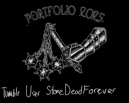
I totally forgot that I can just share my whole portfolio on here. The course I applied for is centered on illustration, graphic design, and printmaking, so I didn’t include any of my sculptures or painting in this (apart from the life drawing in the third slide). Translations below :)
They had a strict limit on the amount of pages you could submit so a lot of stuff I would normally add had to be cut.
Censored my full name to keep my semi anonymity on here lol

Induktri death to this generation (2024)
Album cover, band logo, and graphics for the punk band induktri. The illustration is made with ink and the text is digital.
Selected band shirts (2024-2025)
A few of the band shirts I have designed for different punk, emo, and metal bands
(All the genres are lies or stretches. I was paranoid that if I would confuse the teachers reviewing my portfolio if I put emoviolence, grindcore, hardcore, and powerviolence since they don’t even sound like music genres if you are not in the know)
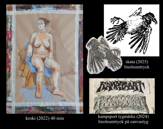
Still life (2022) 40 min
Magpie (2025) Linocut
Kampsport patches (2024) linocut on canvas fabric
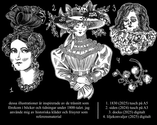
These illustrations are inspired by the woodcut prints that were common in books and magazines during the 1800s. I used historic clothing and hairstyles as references.
1. 1830 (2025) ink on A5 paper
2. Silk (2024) ink on A3 paper
3. Doll (2025) digital
4. Lily of the valley (2025) digital
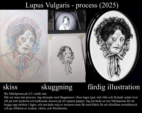
Lupus vulgaris- process (2025)
Sketch, shading, finished illustration
Bic ballpoint pen on A3 paper in an antique frame
Here you can see my full process. I made my sketch with colored pencils in multiple layers (yellow, red, blue) and moved everything to my lightbox to trace my sketch on a separate paper. I used a dried up ballpoint pen to build up darkness in layers, and used the texture you get with that ink to replicate a drypoint print and to give the effect of wrinkles, warts, and decomposition.
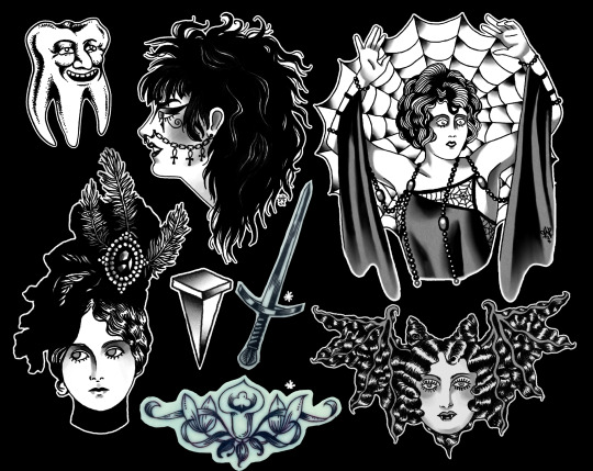
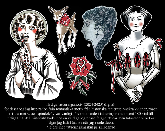
Pre made tattoo motives (2024-2025) digital
I took my inspiration for these from romantic motives from historic tattoo artists. Beautiful women, roses, christian motives, and things like cobwebs were common motives in tattoos during the late 1800s to early 1900s. You historically had a very limited colour range when tattooing which I had in mind when I drew these.
*made with a tattoo machine on silicone skin
(I know this is a bit of a bastardised explanation, I found it difficult to write about these without using tattoo specific terms and references that are hard to understand if you aren’t invested in traditionals. I would never write it like this in my tattoo portfolio)
I have no clue when I will get to know if I get accepted or not, let’s see if its weeks or months of panicking lol

22 notes
·
View notes
Text


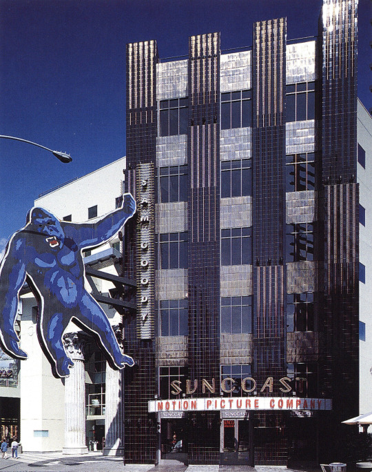


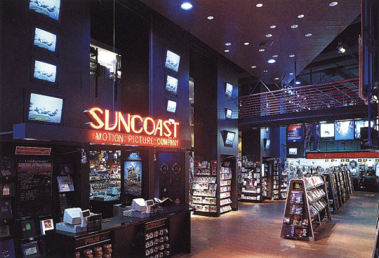
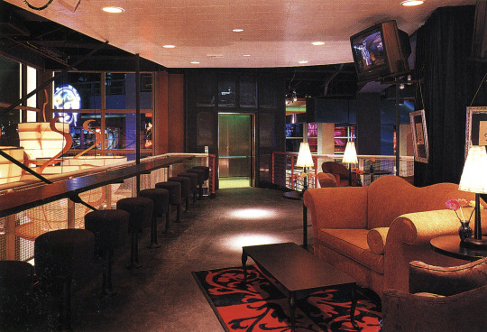
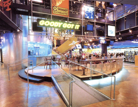
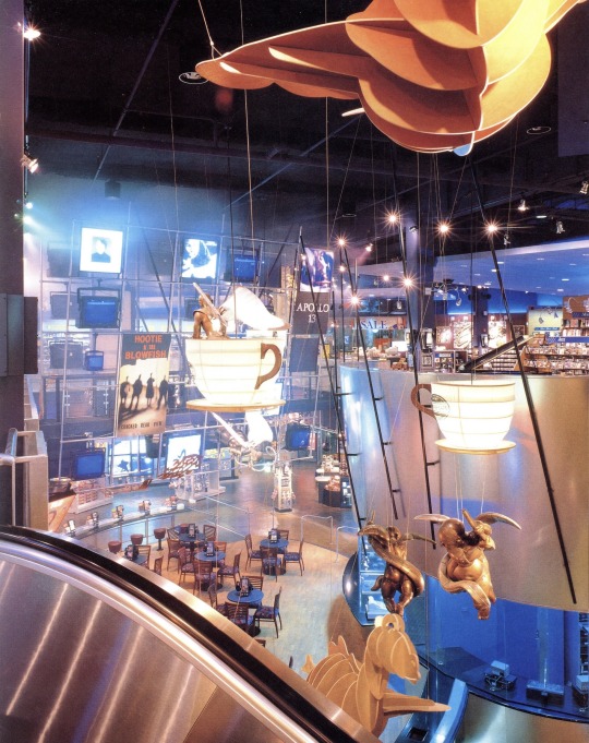
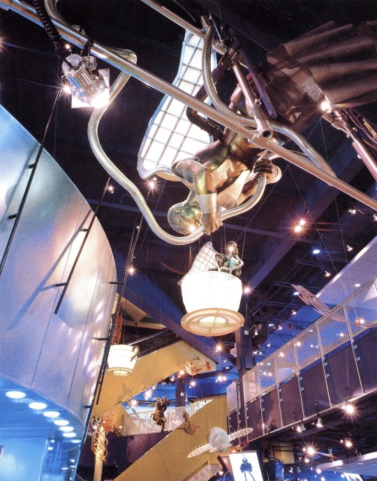


Sam Goody stores at Universal CityWalk & Horton Plaza (1993 & 1995)
"The synthesis of three distinct merchandising departments for the new Sam Goody store at the Universal Citywalk exhibits a design of dynamic expression by the Jerde Partnership design team.
The new building sits on the center court of an outdoor shopping mall in Southern California. Representing the three merchandising concepts of Sam Goody, the design pronounces each area through unique and interrelated façades.
The customer enters the Popular Music department through an animated, neon-accented color plaster façade. The entrance to the Classics department and the upstairs Coffee Cafe is between two 40 foot high, 10 foot in diameter Corinthian columns within an interpretative classical façade. A 35 foot high, two-dimensional profile sign depicting King Kong climbing the face of a black and metallic bronze tile building hangs over the entrance to Suncoast Motion Picture Company (video).
The central sales environment is referred to as Backstage, and has the character and atmosphere of a soundstage/studio. The two-story space is defined by upper level catwalks and the destination mezzanine known as the Coffee Cafe. A three-dimensional, walk-through Media Wall features music advertising, photos, oversized images, photo lightboxes, video monitors, projected music videos, reader boards and graphic elements.
Media events are orchestrated throughout the day in an ever-changing environment that depicts the trends of popular music and movies. Weather reports, current events and promotional messages continuously scroll by on the reader boards. In-store performances, CD signings and record promotions bring a sense of "an event" to the store. A live VJ/DJ controls all aspects of the store's music and video media, and interacts with the customers.
On a floating piano-shaped level, the Classics department features a state-of-the-art inventory of classical and jazz selections and creates a controlled, intimate area for the customer with special acoustics, localized sound systems, listening stations and lighting. In the Suncoast Motion Picture Company department, tall video columns accent the environment, supporting the sale of videos and laserdiscs. Interspersed throughout the department are video monitors creating the effect of video confetti.
The Coffee Cafe features a wide variety of interactive listening stations and media experiences. It is intended to be an intimate environment where the customer can pause, enjoy the fare, engage in conversation and take in views of the store as well as the street below through its windows."
Designed by The Jerde Partnership
Scanned from: Stores - Retail Display & Design (1997), Great Store Design 2 (1996), Shops & Boutiques (1994)
401 notes
·
View notes
Text


A wider angle of Dieter's studio from Nancy Drew: Danger by Design.
Compared to the in-game view (lower image), you can see more detail of the studio, including the legs of Dieter's desk. Additional lighting effects added by the artist to the fish tank and lightbox that were not present in-game.
Featured artist: Bryan Thomas
31 notes
·
View notes
Text
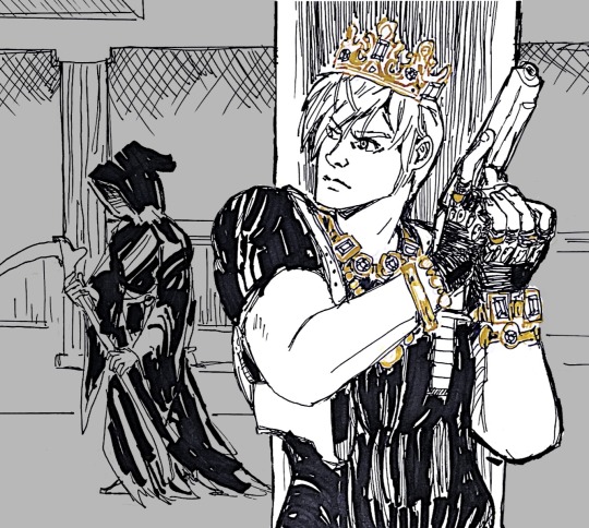
inkvent day 1
i’ve always enjoyed the idea that the reason loot doesn’t take up space in the briefcase is that Leon wears his wealth like a pirate.
(supplies talk after the break)

of course the first day of this calendar is some special effects ink that is impossible to photograph properly afffghhdddddcffffff
today’s ink, fortunes gold, is labeled as “chameleon”, which i guess means the shimmer in it is color shifting? if so the effect is very subtle, an orange yellow to green-ish shift depending on the angle.
while the chameleon effect does very little for me, i do really love the color. yellows are always difficult because they can be illegible, so i love a shading yellow-brown that reads as yellow but isn’t a strain to see.
BUT i was not going to try to ink the whole thing in this color. lololz no way. especially not with the sparkle.
so i went with an extra fine pilot desk pen and pilot parallel for the blacks and an uni emott pencil in yellow for the under sketch. i normally lightbox my sketch but these are supposed to be simple little sketches to test out the inks and not super involved…. i say as i plot out a full ass background. don’t expect this again if there are more of these!
i am so ready for this sketchbook from hell to be finished. i hate this canson ‘pen and ink’ paper so much. two or three more pages and i will be free. when your “no feathering” paper feathers all over the place when using an extra fine nib, you know you done fucked up.
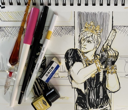
#my fanart#leon kennedy#resident evil#diamine inkvent 2023#diamine ink advent#inkventspoilers#re4remake#you do not want to know where he is keeping the depraved idol#diamine fortunes gold#pilot extra fine nib
127 notes
·
View notes
Text
Amazon-Style Product Photography Tips
I got this message from a lovely follower.
Now, a fairly large part of my new steady job is product photography. Not glamour shots, more documentation. The company I work for makes, among other things, licensed drinkware (think water bottles, mugs, tumblers, etc.). Part of my team's duties is to photograph a mockup or finished product both for our records and to submit to the license holder.
The routine typically goes: put item facing forward in lightbox. Click. Rotate to the left. Click, etc. for the back and right. Then a closeup of the copyright info.
Here, finally, is my question: one of the license holders decreed that all of our photographs must be taken at f/8 and shutter time (?) of 1/25s. This strikes me as… not always optimal, considering the range of colors of objects as well as different materials: polypropylene both transparent and opaque, stainless steel, and lacquered cardboard for packaging. I would love to hear your thoughts on how I might better (while being consistent!) adjust camera settings to account for these kinds of factors
As an added bonus, we let the camera decide white balance/color correction. But I don't think I'm knowledgeable enough to try and correct myself, considering none of the monitors/printers I use are color-correct in the first place. I just know there have been many times where I've submitted photos only for the license holders to be like, "Hmmmm, that green doesn't seem like the right kind of green…RESUBMIT!"
First, I'm going to answer this specific question, but at the end I'm going to recommend a full setup for taking these type of rapid fire product shots.
My answer:
f/8 makes sense. Outside of macro photography, this allows a deep depth of field assuring the photo is sharp and in focus for the entire depth of the product. It is usually the sharpest part of the lens and it is not so small of an aperture that you risk diffraction effects softening your image. They probably were told this by a photographer and thought it applied to all of the camera settings.
The shutter speed is problematic. By forcing it to a fixed setting, your camera is going to choose whichever ISO gives a good exposure. And if you don't have enough light, it will choose a high ISO that will possibly add a great deal of noise to your photo. Noise can corrupt the colors of your photo and it just looks bad.
If your camera is on a tripod and they want the sharpness and depth of field f/8 grants you, then I would set your camera to aperture priority mode (usually Av), lock your ISO to it's lowest number (usually 100) and then your camera will choose the best shutter speed on its own.
So… Camera on tripod Av mode f/8 ISO 100 Camera chooses shutter speed
This is all assuming you are using a tripod and continuous lighting. If you are handholding the camera or using flash, I can rewrite the recipe. Otherwise this will get you very sharp photos with minimal noise.
I'd also recommend getting a shutter release cable so you don't shake the camera when taking the picture. Just search your camera brand and “shutter release” and get the cheap wired version unless you really need wireless.
This is the Canon DSLR one, just to give you an idea.
Be warned, if you do not have powerful lighting, you may get some long shutter speeds. That is perfectly okay as long as it is on the tripod and you aren't shaking the camera when taking the picture.
As far as white balance goes, if you really want it to be accurate, you can order a cheap photography “gray white balance card”. They are as cheap as 10 dollars.
This is the one I use.
There are a couple of ways to utilize the gray card.
Option 1:
You put the gray card in the exact lighting as the product or just hold it directly in front of the product.
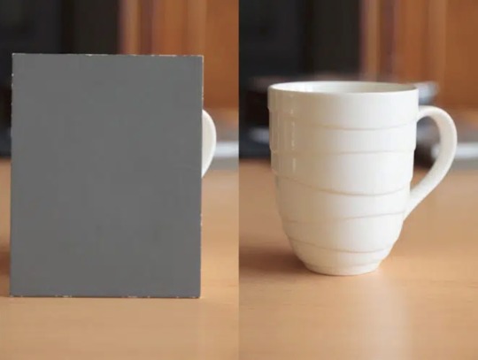
You take all your photos in RAW format (JPEG will not work) and adjust the white balance in Lightroom, Photoshop, or any RAW editing software. Use the white balance picker tool (looks like an eyedropper) and click on the gray card.
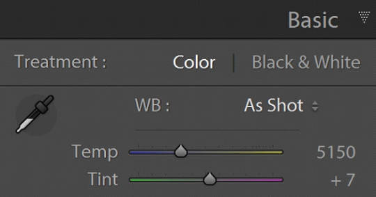
This will give you an exact white balance for that lighting environment. You can synchronize those white balance numbers across all of your photos. Lightroom has a copy and paste function or a "sync" button that will change adjustments in all selected photos as you go.
This is the most accurate option because it allows for “tint” adjustments for extra color accuracy.
youtube
Option 2:
Do the same as above and remember the white balance value. Then set your camera to a custom white balance matching that value. It will probably be around 3200K or 5500K depending on your lights.
Pro tip: If you have any ambient lighting from overhead or other room lights, it could contaminate the photo and skew the white balance into a weird color temperature. Try to make the room as dark as possible aside from your photo lights to avoid this. If you are using flash or have really bright photo lights, this isn't a huge concern.
Option 3:
Use your camera's built in custom white balance tool. It's different for every brand, so you will need to search for a tutorial. But the basic idea is the same. You put the gray card in the lighting of the products, take a picture, the camera analyzes it, and then sets a custom white balance. This can also be done with a white sheet of paper in a pinch.
Here is a video demonstrating the process. Remember every camera brand mau have a slightly different method.
youtube
Good white balance means accurate colors. That is important with product photography and a good value add for your clients. Just be warned, if you change the lighting even a little bit, you have to redo this process. If you bump a light or switch it out for a different one, redo your white balance calibration.
Also, some continuous lights have white balance drift, especially if they allow you to adjust the color temperature manually. Not only will the white balance change depending on the power setting, but it can also change over time. Especially if the lights are used frequently.
Move the lights, redo white balance. Change the power, redo white balance.
And if your lights are stable and on the same power all the time, I’d still redo the white balance every week or so. Personally I would do it before every shoot, but you’ll have to decide if that is worth it depending on how fast you need to turn things around. I usually do it as my first photo in the series so I can set the white balance, select all the photos, and copy the settings to all of them at once.
The nice thing about doing white balance with a gray card is that the results are display agnostic. Even if your monitor is poorly calibrated, you can be assured the white balance is accurate. And if someone says your photos are green, it will be their monitor and not your problem.
You just have to avoid doing any color specific adjustments to the images. Trust the gray card and white balance tool more than your eyeballs and display.
You can boost saturation a tad, but that is all I would mess with unless you know what you are doing. Even if the photos look a little drab or not very colorful, I would leave it alone. It sounds like the importance for this task is accuracy of color rather than making them as pretty as possible.
------------------------------
Okay, that is the question answered. Now I'd like to go through how I would build a setup to do this kind of work.
In the product photography world, this workflow is referred to as "pack shots." The idea is to create a consistent setup so you can just swap out the product one by one and speed through the shoot. It is best to control as many variables as possible so all you need to do is set the product down, take the shot, and repeat.
I'm going to show you my ideal pack shot setup with a light cube. I think it will be similar to what my follower is using. And, if not, it might help him streamline his process a bit.
A light cube is just a box made of diffusion material.

You drape a background with the color of your choice. White is usually preferred for Amazon-style pure white background photos. Though I prefer dark gray for aesthetic reasons. You just want to make sure the backdrop has that natural gravity curve so there isn't a hard line or wrinkles.
For lighting, you should get two *identical* lights. They can be desk lamps as long as they are the same and have the same light bulb inside. Then you just place them on either side of the cube. You want the ball of light on the cube to be in front of your subject.

Remember, your light source isn't your actual lights. It's the ball of light on the sides of the cube.
If you want to make it a little fancier, you can get a black or white acrylic sheet to create a reflective surface. You want it as far forward as possible and a little elevated. Here are some things I did in a simple light cube with the setup above.
Here is what the white acrylic looks like.
I placed a big book under the acrylic sheet like this.

This allowed me to hide the curve of the background and get a nice crisp transition between the acrylic and the background.
And if you do white acrylic, you can get the background to seamlessly blend.

As I said, two desk lamps will work, but if this is for a business and you want something fast, convenient, and reliable, I would suggest something more robust.
I'd probably get two daylight balanced COB (chip-on-board) LED video lights that have a Bowens mount attachment.
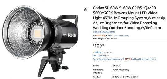
This Godox light is very reasonably priced for its features.
Daylight balanced means one consistent color temperature, so less chance of drift. These are very bright so you can use a quick shutter speed and you won't even need a shutter release cable (still a good idea). You also don't *need* a tripod, but you should still use one. The main advantage of bright lights is they can't be overpowered by room lights. You can be assured any overhead lights or window light will not contaminate your photo. A darker room is always preferable, but if you crank these it won't matter.
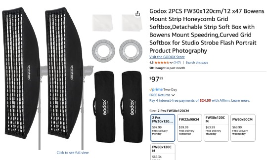
The Bowens mount allows you to place any modifier you wish on the light from softboxes to reflectors. But the standard reflector should be fine for the light cube. But if you are taking photos of tall cylinders, a couple of strip boxes might help.
Don't worry about putting the grids on. You just line them up towards the front of the light cube so you have even light from the top to the bottom of your cylinder. Again, this is optional.
Since these lights are so versatile, you can do any kind of lighting for any other photographic needs. Slap on a white umbrella and take company portraits if you want. Or you can use them as video lights to film a worker safety video.
So, here is my recommended ingredient list for a pack shot light cube setup.
Light Cube COB video light Black Plexiglass Seamless paper (color of your choice)
Colored poster board also works if you keep it from getting dinged up. And the light cube also comes with some cloth backgrounds, but watch out for wrinkles.
BONUS TIP: If you want that pure white background like in Amazon shots, add a third light from behind with no background paper. Make the light cube material your background and shine a light through it. You have to make sure it is bright enough to give you pure white, but not too bright that the light blasts your subject from the rear.
Otherwise just use a white backdrop and use Photoshop to brighten it to pure white.
Karl Taylor shows a pack shot setup without a cube, but the same principles apply. He shows you how to dial in that white but not too white background. Just imagine instead of shining a light onto a background, you are shining a light through the background (the back of the cube).
youtube
12 notes
·
View notes
Text

Bad Luck Barthazar, Tabaxi Assassin
Don't let him cross your path.
The image(s) above in this post were made using an autogenerated prompt and/or have not been modified/iterated extensively. As such, they do not meet the minimum expression threshold, and are in the public domain. Prompt under the fold.
Prompt: Chain-lash CerbeBoss the Cerebus-Man, Tri-headed Master of the Underworld, creature illustration, Amber, Periwinkle, Moss-Green colorscheme, crytozoology, themed, fullbody portrait, in the black forest:: Samurai, thundercats Panthro, on white background, ready pose, fullbody, , booboo bear, fullbody, on white background, , victorian:: amazon's newest costume, in the style of forced perspective, blocky, post-internet art, snailcore, slender, cut/ripped, adafruit:: louis vuitton has an amazingly detailed building facade, in the style of organic and flowing forms, thai art, vray, dragon art, white and indigo, loish, luminous quality:: ,taylor swift has a black leather outfit, in the style of intense movement expression, lightbox, 8k resolution, carnivalesque, sharp focus, gray and bronze, overexposure effect
--
This is a 'prompt smash' experiment, combining random (mostly) machine-generated prompts into a single prompt with multiple sub-prompts. Midjourney blends concepts in these situations, making vivid but essentially random results.
#unreality#midjourney v6#generative art#ai artwork#public domain art#public domain#free art#auto-generated prompt#tabaxi#khajiit#cat anthro#fantasy art#D&D#dungeons and dragons#high fantasy#character portrait
10 notes
·
View notes
Text

The beginning pencils for redoing the Godcleaver introduction (or as I call em, raw pencils)! These are what they look like RIGHT after using the lightbox. NOW I get to go in and do all the pencil details like figure water ripples or sky effects or shadows.
Redoing the introduction for the comic for some very specific and personal reasons so I hope no one minds a delay ...
26 notes
·
View notes
Text

Image Gallery Lightbox Effect
#image gallery#lightbox javascript#lightbox effect#responsive image gallery#html css#divinector#css#frontenddevelopment#webdesign#html#css3
5 notes
·
View notes
Text
how I make my manga patches: a shitty tutorial
figured I'd make a post explaining my technique for making the patches I put on my hororen jacket and other projects. because they're cool and more people should do them
here's how I turned this panel into this patch for my hao pants I'm working on:


you will need:
fabric to paint on (I'd recommend a white fabric without a lot of texture. I'm pretty sure the one I use is some kind of polycotton blend?)
basic sewing supplies (needle, pins, thread)
a laptop/tablet you can lie flat on your desk OR a lightbox + printer
pencil (the softer and darker the better, I use 6b)
thin paintbrush
acrylic paint
fabric medium (optional)
thick gloves (if you're tracing off a touchscreen you WILL need these)
pinking shears (optional)
scissors
decide the scale of your patch. for this project I made a digital mockup and then measured how big I wanted it to be on my project. I settled on 3 inches wide
download the image you plan to trace and either zoom in to the right size or scale and print it (I don't own a lightbox myself but using it should provide a similar effect to my method.
lay out your screen or lightbox flat on your workspace and put your fabric over the image (I'd also recommend ironing your fabric before this if you can). If your fabric is thin enough you should be able to see the lines through it.
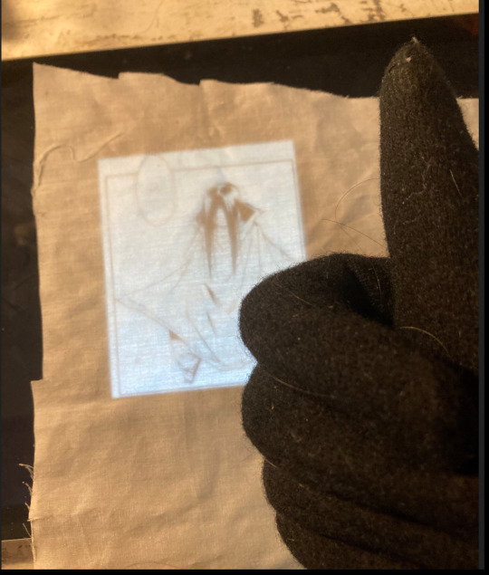
this is where you want to put on your gloves if you're tracing off a touchscreen. without gloves, your hands can sometimes cause the screen to move or zoom in while you're tracing.
now you just need to trace the image onto the fabric with your pencil. this is the absolute WORST PART and to minimize suckage I recommend
checking you're aligned with your previous marks before you make a new one
tensing your fabric along the grain or crossgrain with your hand as you draw, so it doesn't shift (don't fuck with the bias that'll cause problems)
taking your tracing OFF the screen to add the finer details (tracing directly is most important for the big shapes and faces)
using a soft, dark pencil to avoid damaging your screen (you can also add a sheet of transparent plastic between the fabric and the screen, but I've found this makes the fabric slip more)
shading in the flat black areas so you don't forget them later


here's my penciling after finishing on the screen and fully finished
4. now it's time to paint over the pencil
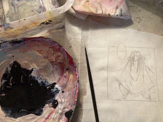
I use a cheap, probably terrible acrylic paint and mix it with a textile/fabric medium. This makes the paint flow better and raises its longevity on the fabric. It's not necessary to use, especially if you don't plan to wash your finished project (acrylic paint is plastic once it dries, it shouldn't chip off too easily).
then you just. paint over the pencil. take you time and steady your hand on the desk. if you're worried about smudges work top-bottom and left-right/right-left depending on your dominant hand.

here's mine fully painted. once the paint is dry, I heat seal it with an iron (and a pressing cloth, so if it sticks I don't have hao fused to my iron forever)
5. cut out the patch. I like to use pinking shears to reduce future fraying, but if you don't have those you can either manually cut notches or fuck it we ball a straight edge.
then you just pin and sew it to your project. boom done
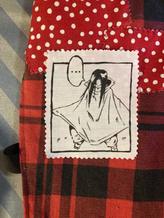
now you can make as many as you want and add them to everything!
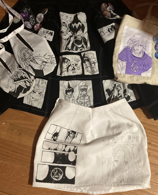
I've used this technique for:
aaaaallllllllllllll the patches on my hororen jacket (took FOREVER don't try to hand sew through SUEDE kids)
tie-on pockets (EVERYONE MAKE THESE THEY'RE SO HANDY)
a cell phone pocket on my cozmez ita bag
painting my favourite manga pages directly onto a skirt (wip because that fabric is a nightmare)
you don't need to just stick to manga panels either, anything works as long as it has clean, defined lines (but manga/comic panels are definitely easiest). if you look at some of the patches on my jacket you can see I've used coloured screenshots and official art and just traced over them in black. would recommend colour correcting images like that to make the lines easier to see, though
I love this technique because I love dressing up for cons but I don't enjoy making cosplays themselves. so I just make an insane jacket wear it to a con and then wear it in regular ass life. shoutout to the three people who recognized my jacket at fanexpo toronto last august. highlight of my life.
#I don't know what to tag this as you get it raw#I don't think anyone cares either so#if you use this please show me!!! I want to see!!!
20 notes
·
View notes
Text
it's interesting how UI influences people in subconscious ways - the one person I showed the archive to immediately tried to click the entries, much in the way social media primes us to click posts, before I'd actually programmed that functionality in.
The standard before social media was the expectation that an image link would probably lead you away from the page, or that if an image is embedded you sort of expect it to stay that way - maybe a gallery has its own page with an index for navigation, even with Deviantart it wasn't really the fullscreen lightbox effect you got when you clicked an image to take a closer look.
Another problem she had was with navigation, having everything load in rather than open a new page without any work-arounds also means it just goes back to whatever you were doing before you opened the site - in this instance, an empty new tab.
There's ways of keeping things in the session memory to return to whatever you were doing last, but I've found some other oddities with how targeted links seem to recover past functions, even if the target isn't tied to anything specific? it's weird! but interesting! something I need to fiddle with.
2 notes
·
View notes
Text

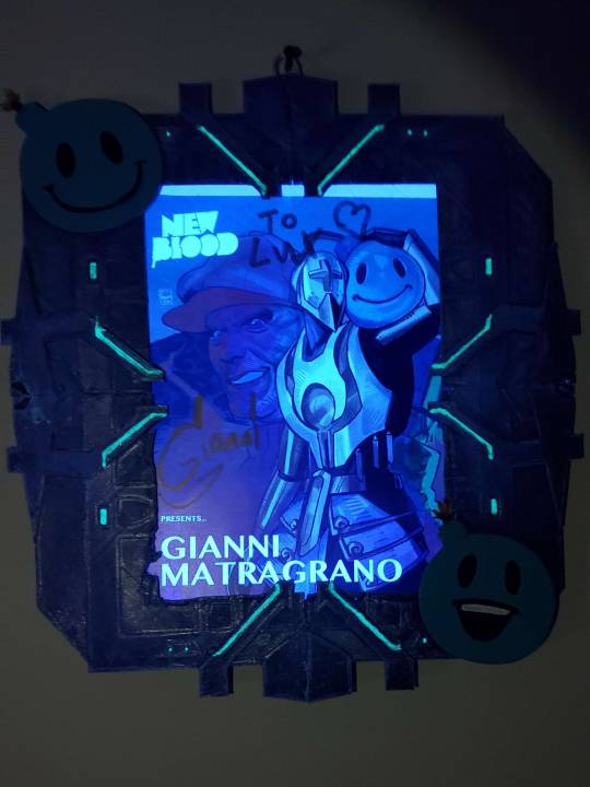
(Edit: did end up sending this to Gianni. After more than FIFTEEN attempts[which is just sending it in a dm, not like a full submission process or something. twitch dms just never send] over the course of the past 2 weeks, eventually just the link went through, but not the explanation where I told him what it was and that he was free to hunt me for sport for sending like 8 pieces of fan art in the last month. So, sarcastically, knowing it wouldn't send, I said "Oh, yeah, twitch??? You'll send the link but not the explanation?" AND THAT ONE SENT. FUCK ME.)
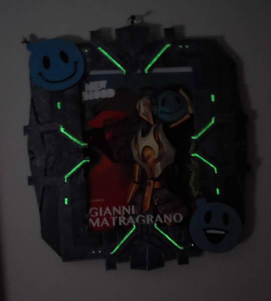
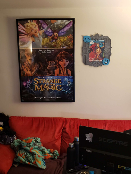
Designed and printed a frame for the signed print I got at PAX. It now hangs up on the wall behind the couch I lie on when I'm on my computer, next to another of my prized possessions, the cinema size lightbox poster for Strange Magic that one of the animators of the film found in a storage closet in Singapore and gave to me(it's also signed by several of the film's animators).
The frame is supposed to be one of the portal gates from Quake Champions, which is one of the main games that Gianni streams during Fraggy Friday as well as being the game he was playing on the first stream I attended. On two of the corners are the two versions of his pngtuber mascot.
Normally, the portal gate itself does not glow in those spots in game but there's usually a bright glowing portal in the middle so I added some glow in the dark paint in a few spots to capture a bit of the effect.
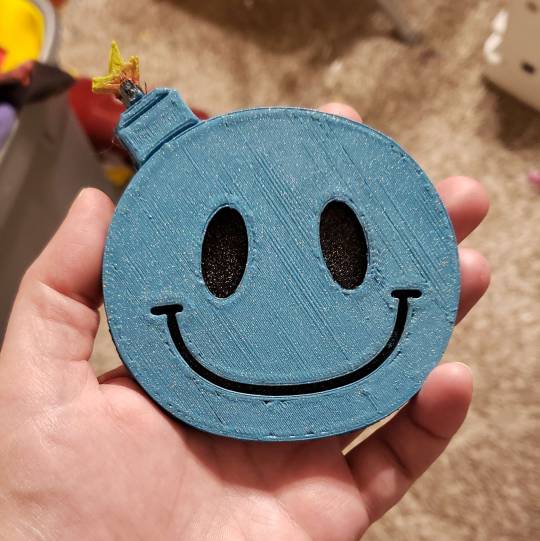
It was a bit of a comedy of errors printing and assembling this thing and there were several misprints, including a section that printed far too thick. I pulled the smiley bomb off of the thick print, put a foam backing on it, painted it, sealed it with my new iridescent mod podge sealant, and stuck a magnet on the back and now it's part of our ever growing whimsical fridge magnet collection.
(edit: added better pictures of the glow in the dark parts)
#debating whether to send this one to Gianni#on one hand I think he'd find it neat#on the other hand I've now sent him like 8 pieces of fan art since his last stream#and one additional one I only sent to Marieke because I was already so ashamed of the art spam#and at some point I feel he'll have no choice but to hunt me for sport#getgianni#my art
13 notes
·
View notes
Text
Little and Broken
This started as a little Shortie for an ask from @wingsofthesun and instead turned into THIS.
(Who is Callie?)
~~~~~~~~~~
Eclipse pressed himself flat against the wall as he peered into the living room. The lightbox (teevee Silver called it) was on, and colorful images flashed across the screen.
Silver and the human woman sat on the couch, with the hedgehog snuggled up close to his mother. Her hands ran absently through his quills, and every now and then he would turn his nose to nuzzle against her side.
At first, Eclipse wasn't interested. They watched that teevee almost every night, sometimes laughing at what they saw, sometimes crying, sometimes cheering. He didn't understand--they were just some sort of transmission. He'd seen similar ones on the Comet--feeds of various planets the Black Arms were studying to destroy more effectively. (Even though they were the strongest warriors in the galaxy, they still didn't want to waste effort and energy in an attack that could be won in a simpler way.)
He didn't get the appeal. Or how they could become so invested and reactionary to the images. It seemed silly.
The darkling had stayed in his little closet, trying to ignore the noise from the other room as he napped. But then, certain bits of dialogue came to him, and his curiosity got the better of him.
"Monstrosity? What you see before you, is the first of a new species. I call it, Experiment 626."
Eclipse's brow furrowed. He poked his head out through the blanket acting as the door to his 'room'.
"He is bulletproof, fireproof, and can think faster than super computer. He can see in the dark, and move objects 3000 times his size. His only instinct, to destroy everything he touches!"
The darkling crawled out from his hidey hole, making his way to the archway between the kitchen and living room. This was sounding interesting. It sounded a lot like him! A creature created to be a fierce warrior! To be strong and capable and formidable and--
"So it IS a monster."
That stopped him in his tracks. Monster? No, he was created to be the best parts of the Black Arms. This, well, whatever it was on the teevee was also created to be strong, to be a warrior. That's not a monster.
Eclipse slid against the wall, being careful to stay out of sight as he watched the events on the screen.
"And as for that abomination, it is the flawed product of a deranged mind. It has no place among us."
"The council has banished you to exile, on a desert asteroid."
That word made Eclipse's heart clench. He wasn't quite sure why he was on this backward mudball of a planet, but he'd always thought it was for some secret mission. Some valuable scouting mission for his father, the great and powerful Black Doom. It's what helped him keep his sanity in those early days.
But late at night, he thought of that word. Banished. And part of him whispered that that's really what happened. He'd failed his father one time too many, and now he was sent away. Banished to die alone on this pathetic planet, full of pathetic humans.
He tried to push that thought away.
On the teevee, Experiment 626 managed to escape. Eclipse watched with wide eyes as the ship he stole headed toward Earth.
~X~X~X~
"This is you. This is your badness level. It's unusually high for someone your size. We have to fix that."
Eclipse wrinkled his muzzle. Experimen--Stitch, wasn't bad. That was how he was created! It was just who he was. Changing him meant making him be a different person. That wasn't fair. That wasn't right.
He didn't like the humans in this transmission. Not at all.
~X~X~X~
"Look at him Lilo, he's obviously mutated from something else. We have to take him back.”
“He was an orphan and we adopted him! What about ohana??”
“He hasn’t been here that long!”
“Neither have I! . . . . Ohana means family. Family means nobody gets left behind, or forgotten.”
Silver laughed at this part, pointing to the teevee.
“Look! That’s just like what happened with us when Eclipse came!”
The woman laughed a little, nodding. “Yeah, that’s kinda the gist of it, isn’t it? You were all about keeping him and I, well, needed a little convincing, didn’t I?”
“You were just mad because he bit you.”
“Oh, and that was so unreasonable!”
The two laughed a little more, and Eclipse looked on from his hidden spot near the archway.
The hedgehog was right. That was very similar to how it played out. To be fair, the darkling still wasn’t completely sold on the idea of staying here. His arm was healed, but the weather was getting colder outside. He’d never survive without shelter. And the human had welcomed . . . well, accepted him into her home without any demands for repayment or compensation. Sure, he couldn’t fight or hurt anyone, but that was a small price to pay for warm shelter and a full belly, right?
That word kept repeating through his head, though. Ohana. The older human in the transmission didn’t seem to want to keep Stitch, but the little one was insistent they did. Because of ohana. Family. She saw Stitch as family, even though he caused trouble, and had only been there for a short time.
His eyes wandered to the couch. Silver was like that. He had wanted to help Eclipse from that very first night he’d appeared, trying to snatch food from their trash. And the hedgehog was so happy to have Eclipse here now.
But the woman wasn’t as sold. Just like the one in the transmission. She was more wary of Eclipse. She was more interested in taking care of Silver, like the one in the teevee was all about caring for her sister. They were just the same.
It was strange how similar it was.
~X~X~X~
“This little girl is wasting her time. 626 cannot be taught to ignore its destructive programming.”
“This is interesting. 626 was designed to be a monster, but now, there’s nothing to destroy. You see, I never gave him a greater purpose. What must it be like to have . . . nothing? Not even memories to visit in the middle of the night.”
Eclipse stared at the teevee with wide eyes. Was that . . . was that like him? He had been created as the Black Arms’ greatest weapon. A prince to the most dangerous and destructive race the galaxy has ever known. His entire life, since he was hatched, has been dedicated to fighting, destroying, being stronger and better than everyone and every thing else.
But on this planet, he didn’t have to fight. He didn’t have to destroy. He didn’t have to earn his right to exist, or suffer the consequences of failure.
He was still allowed to stay here, even if he didn’t prove his strength. He was still allowed to eat, without having to fight others for the barest morsel.
But if he didn’t do what he was created for, what did that make him?
The only difference was, Eclipse did have memories. But they weren’t exactly the type he wanted to visit in the middle of the night. Because they hurt. And were scary. And reminded him of just how much of a failure he was.
~X~X~X~
The humans were on the beach. Riding some sort of boards on the waves in the water. They laughed and had fun together. Stitch watched them.
Eclipse watched, too. His gold-on-black eyes flicked to the couch, where Silver and the woman sat. Silver leaned closer, and the woman reached down to pull him closer, wrapping her arms around him tightly. She rested her chin on the top of his head, and a smile curled the hedgehog’s lips.
Stitch reached for the little human. Wanting to be included. Risking a return to his greatest weakness. Just to be part of their family.
The darkling stared.
~X~X~X~
“I hear you cry at night. Do you dream about them? I know that’s why you wreck things, and push me.”
“Our family’s little now, and we don’t have many toys. But, if you want, you could be part of it. You could be our baby, and we could raise you to be good.”
“Ohana means family. And family means nobody gets left behind.”
“But if you wanna leave, you can.”
Anger stirred in the darkling. He hated this transmission. He shouldn’t be wasting his time watching this—he was a weapon, a warrior, and should have been spending every moment training to be stronger. Better. What did this transmission do to help him? Nothing. He should just head back to his closet and rest, so he can get up at first light and restart his training. He’d gone too long without it, and knew his father would have found that disgusting and unacceptable.
He should. It was what his father would want.
But he couldn’t move.
His eyes moved back to the teevee. And he hated himself for being so weak.
~X~X~X~
“L-l-lost.”
“I’m lost.”
Eclipse nearly ran into the room to break the teevee. He hated this. Something was stirring deep within him, and he didn’t know what it was, but it made him angry and sad and scared and his stomach twisted and clenched.
His eyes burned with tears and he grit his teeth to keep them away.
Weapons didn’t cry. Weapons didn’t feel sad or scared. Weapons fought. Weapons won.
The darkling clamped a hand over his mouth to keep from screaming.
~X~X~X~
“Waiting.”
“For what?”
“Family.”
“Aaahh, you don’t have one. I made you.”
“M-maybe I could . . .”
“You’re built to destroy. You can never belong.”
That thing stirring inside Eclipse surged, and he swallowed down tears. Bit back sobs. He never should have started watching this transmission. It did something to him, and he couldn’t stop it, couldn’t control it.
The thought of breaking through the glass door and running off into the night flashed through his mind.
But he couldn’t.
~X~X~X~
A heartbreaking separation. An unlikely alliance. A daring rescue.
Stitch, this little monster, this abomination, this creature who was only created for destruction, became a hero. He found his family. Found his purpose. Found his place.
“This is my family. I found it, all on my own.”
“It’s little, a-and broken. But, still good.”
“Yeah. Still good.”
And now the feelings within Eclipse couldn’t be contained any longer. They churned inside, pushing their way out, whether he wanted them to or not. Tears rolled down his cheeks, soaking his muzzle and dripping onto the floor as he held his head. Sobs barked through his throat, and he scurried back to his closet, curling up with his tail wrapped around him.
Silver and the human appeared, identical looks of worry and shock on their faces.
“What’s wrong??” the hedgehog cried, his hands yanking on one of his long head spikes.
“I dunno.” The woman knelt in the doorway, looking like she wanted to touch him, but hesitant to do so. “Eclipse? What’s going on? Are you hurt?”
Worried. They were worried about him. They heard him crying and came running to make sure he was okay.
Both of them. Even the human.
He squeezed his eyes shut, curling up tighter.
“Go away!”
He wanted to scream it, bellow it, turn and lash out at them. How dare they. How dare they make him feel this way. He wasn’t supposed to feel. He was only supposed to hate. To conquer. He didn’t want to feel like he could relax, and be comfortable, and not worry about being beaten or starved or punished for not doing just the right thing.
Because that was wrong, all wrong. His entire life was about strength and fighting and being better and never, ever, ever disappointing his father, even though he seemed to do it all the time. Even when he tried his best. His best was never, ever, ever good enough.
“Hey,” the woman called, shifting to sit on her ankles. She glanced over at Silver and encouraged him to do the same. “Hey, shhh. Take a deep breath, okay?”
Why should he listen to her? She wasn’t his guardian. His caretaker. His m-mother. She was Silver’s and that’s it. She only cared about him, not Eclipse. She only begrudgingly allowed Eclipse to be in her home, taking care of him only out of obligation, because that’s what Silver wanted. She didn’t want him here. She didn’t care.
“C’mon, deep breath,” she said again, her voice soft and soothing. “Focus on that for me, okay?”
He didn’t want to. Every fiber of his being was screaming at him to just lash out—to slash and bite and punch and kick. He hated these feelings and wanted them gone.
But he found himself pulling a deep breath in, and letting it out slowly, following her lead. She smiled and said soothing words to him, continuing this slow breathing.
After a few more breaths, Eclipse’s tears slowed, and he uncurled, but kept himself in the furthest corner from them.
“Better?” she asked, a little smile on her lips. Eclipse turned away, but nodded once. “Good. Are you hurt?” He hesitated before shaking his head. “Okay, also good. Do you wanna talk about it?” Another head shake, this one more immediate. “Okay, that’s fine. You don’t have to if you’re not comfortable. But both Silver and I are here if you change your mind.”
Eclipse grunted in response. He wouldn’t change his mind. What could he say? The transmission they were watching made him feel things? How stupid. It was stupid.
“How about some ice cream?” Silver asked, flicking his amber eyes between Eclipse and his mother. “That always makes me feel better after I get upset.”
The darkling turned slightly, an eyebrow raised. He wasn’t much for the sweet foods Silver seemed to like, but ice cream was something he could tolerate. Even if it was cold. He gave the hedgehog a little nod.
“That’s an excellent idea, Bug,” the woman said, pushing herself to her feet. “C’mon kiddos. Ice cream makes everything better.”
Silver quickly followed after his mother, a big smile on his lips. Eclipse slowly crawled out of his closet, watching as they gathered bowls and spoons.
This world was nothing like his home on the Black Comet. These people were nothing like the Black Arms’ or Black Doom.
But maybe . . .
Maybe that was okay.
~~~
Like this? Check out my other snippets. Reblogs are appreciated!
32 notes
·
View notes
Note
Do you have recommendations for autism-friendly (or sensory friendly) evening activities a person with ASD could partake in with their NT partner?
Hi there,
Many articles I’ve found focused more on children, but I did find on that lists some things to do. It’s a long excerpt, so I apologize in advance:
Deep pressure activities involve applying pressure to the body, which can have a calming and grounding effect. Examples of deep-pressure activities include:
* Weighted blankets or vests
* Compression clothing, such as compression shirts or pants
* Swaddling or wrapping the body in a blanket
Tactile activities explore different textures and sensations. Examples of tactile activities include:
* Trying out various water temperatures, like slightly warm, room temperature, cold, and ice
* Making patterns on a surface using wet brushes/sponges or squeeze bottles filled with water.
* Touching or playing with different fabrics, such as silk or faux fur
Visual stimulation activities use the sense of sight to promote relaxation. Examples of visual stimulation activities include:
* Watching calming videos or nature scenes
* Using a lava lamp or other visual sensory toys
* Using a lightbox or projector to display images or patterns
Examples of DIY Sensory Activities for Adults with Autism
Sensory Bottles
Sensory bottles are easy to make and can provide visual and tactile stimulation. Simply fill a plastic bottle with water, glitter, and other sensory items such as beads or sequins, and seal the lid tightly. Individuals can shake the bottle to create a soothing visual effect.
Sensory Bins
Create sensory bins by using a plastic storage container filled with various sensory items such as rice, beans, or sand. Add small toys or objects for individuals to explore and manipulate, such as small plastic animals or scoops and funnels.
Fidget Toys
Fidget toys are small handheld objects that individuals can manipulate to provide sensory stimulation and improve focus. Examples of DIY fidget toys include creating a sensory bag filled with different textures or making a stress ball using a balloon and filling it with rice or flour.
Sensory Activities for Adults with Autism
Sensory activities are important not only for children with autism but also for adults.
Here are seven examples of sensory activities for adults with autism:
1. Yoga
Yoga is an excellent sensory activity. It improves body awareness and proprioception while calming the nervous system. It also provides a structured and predictable environment, allowing individuals to feel more in control of their bodies. Plus, it's a low-impact physical activity that enhances their coordination and balance. Yoga classes can be tailored to meet the unique needs and abilities of individuals with autism, and modifications and props can be used to provide additional support.
2. Massage
If you're looking for a relaxing and sensory experience, consider trying massage therapy! Not only can it help reduce anxiety by providing deep pressure input, but it can also improve body awareness and leave you feeling calm and centered.
3. Aromatherapy
Aromatherapy involves using essential oils to promote relaxation and reduce anxiety. Certain scents, such as lavender, can be particularly calming and can promote better sleep.
4. Dance Party
Dance parties are a fun and engaging sensory activity for adults with autism. They improve listening skills, coordination, and rhythm. It's a positive outlet for energy and reduces stress and anxiety. Dance parties can be done alone or in a group in a safe and welcoming environment. It is a way to express oneself creatively and emotionally while boosting self-esteem and confidence.
5. Popping Bubble Wrap
Bubble wrap popping is a versatile and enjoyable sensory activity for all ages, including adults with autism. The bubbles provide tactile input, while the popping sound offers auditory feedback. It's a simple yet effective way to manage stress and anxiety and can be done using hands or feet, making it a great addition to any sensory tool kit.
6. Pottery
Working with clay and creating pottery can be a therapeutic and tactile activity for individuals with autism. It can provide a sense of control and accomplishment, as well as promote relaxation and stress relief. The tactile sensation of working with clay can also provide deep pressure input, which can help regulate the nervous system.
7. Autism-friendly Beanbag Chairs
Beanbag chairs offer a secure and snug spot for people with autism to unwind and take part in various activities, from reading to sensory games.
Hopefully you and your friend can find something to do with these. The link will be down below if you want to read more:
Thank you for the inbox. I hope you have a wonderful day/night. ❤️
26 notes
·
View notes